UpGuard’s Design System
UpGuard had one product when I joined: UpGuard Core. It was a beautiful pile of UX debt. This is case study is focused on how a design system was developed. Later, we applied it when designing UpGuard CyberRisk.
Problem
How might we create a system so that our software is predictable and meets expectations (good products act like good people)?
Results

The process
When I first joined UpGuard, we created a brand guide. Concurrently, I was conducting a lot of interviews and exploration in order to understand the product architecture, product usage, and the users themselves. Using that knowledge, we then built a philosophy, layout foundation, components, and interaction patterns.
Brand Guide
Colors
Typography
Logo guidelines
Imagery guidelines
Iconography guidelines
Design System
Components
Patterns
Layout
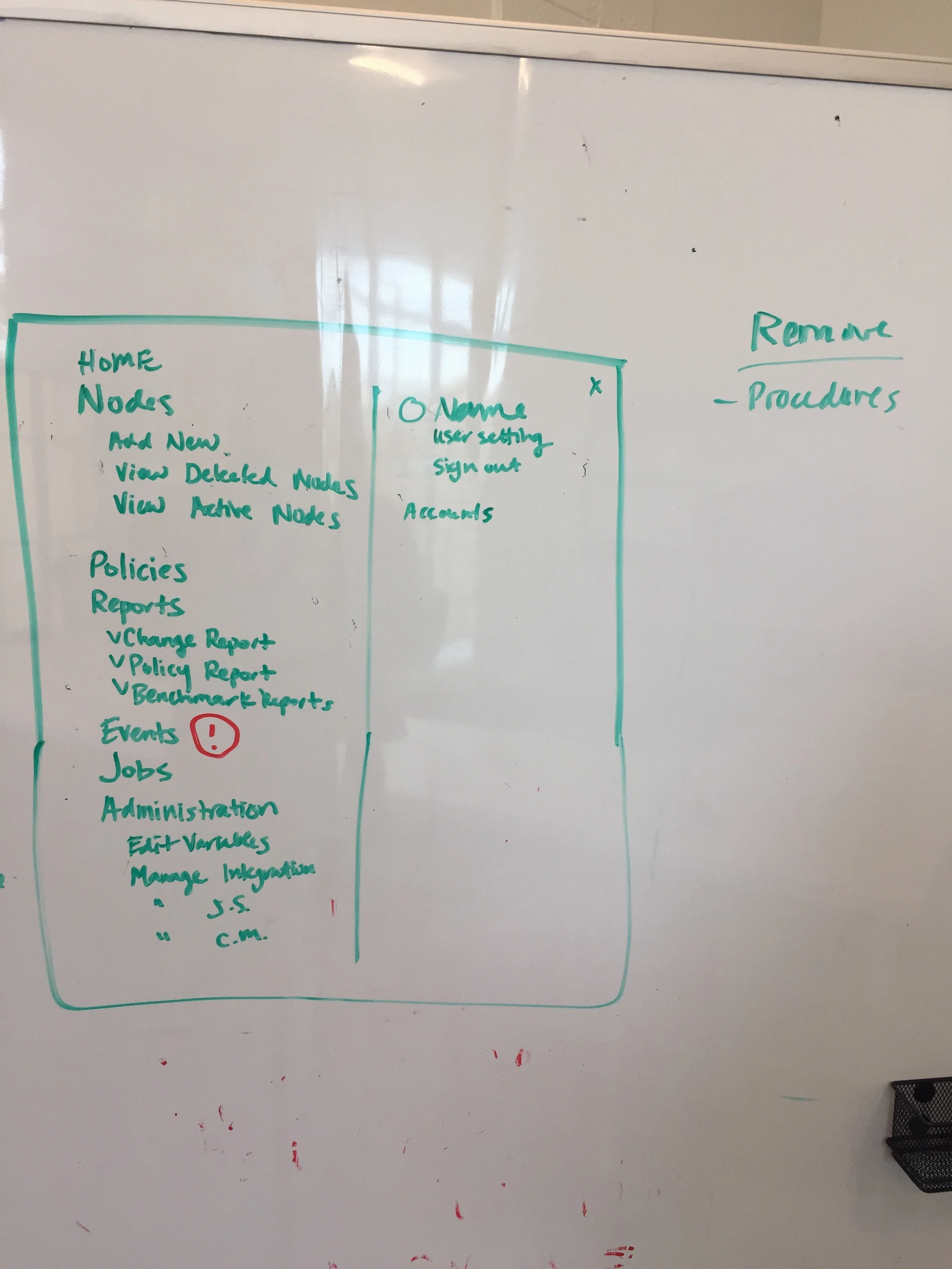
Understand product architecture
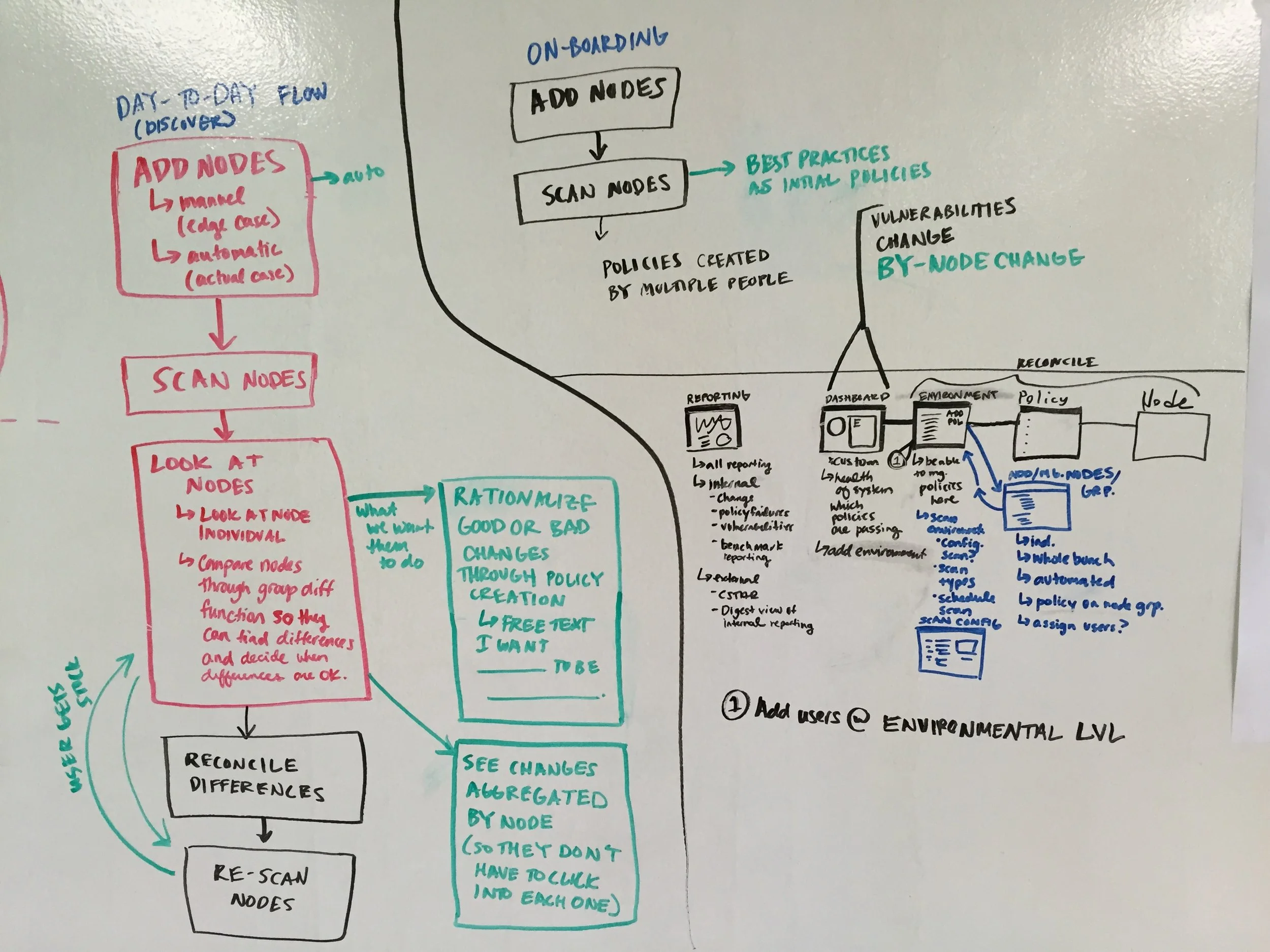
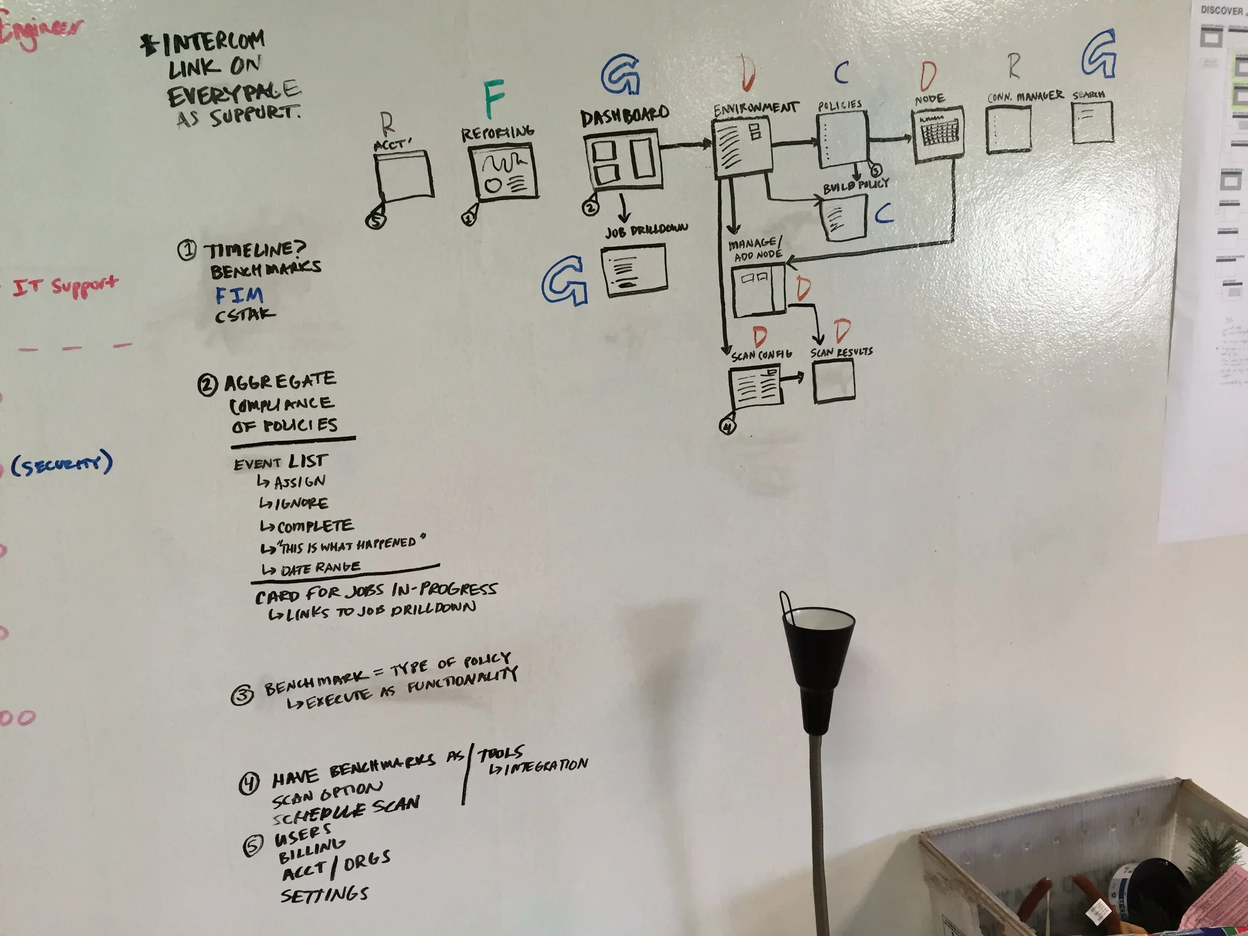
We made a map of the product to get a sense of how the navigation worked and where confusion might occur.
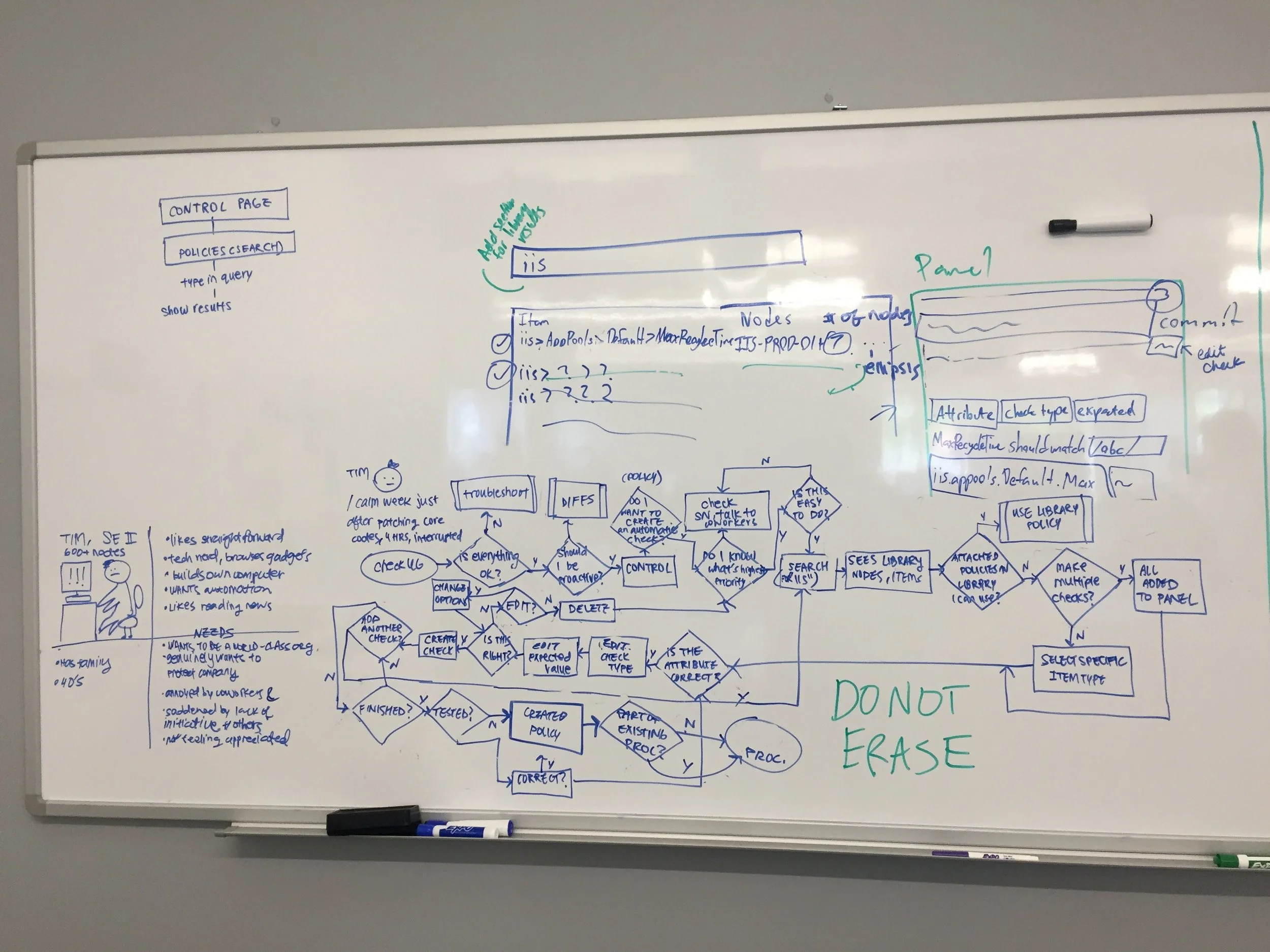
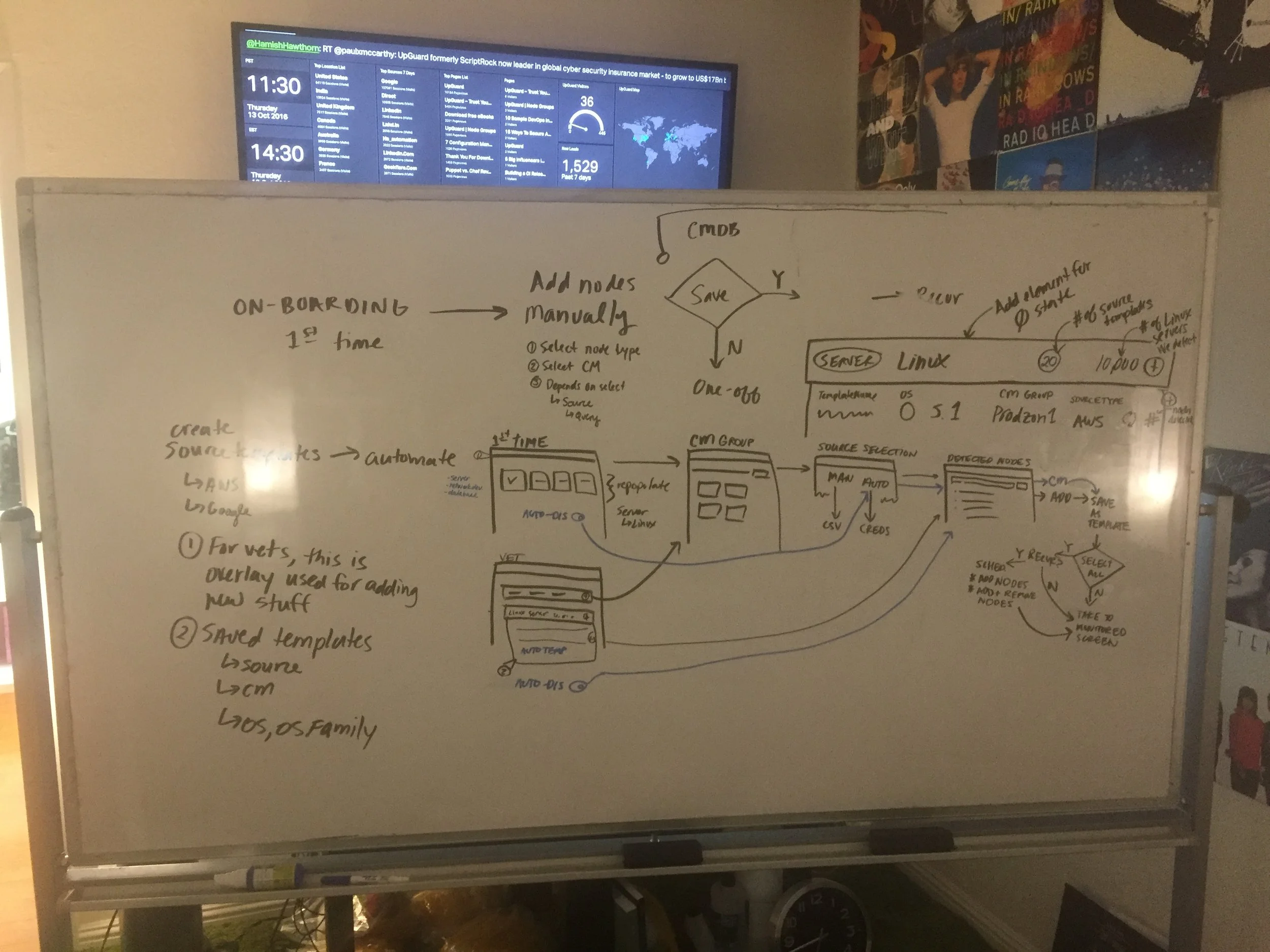
Understand product usage
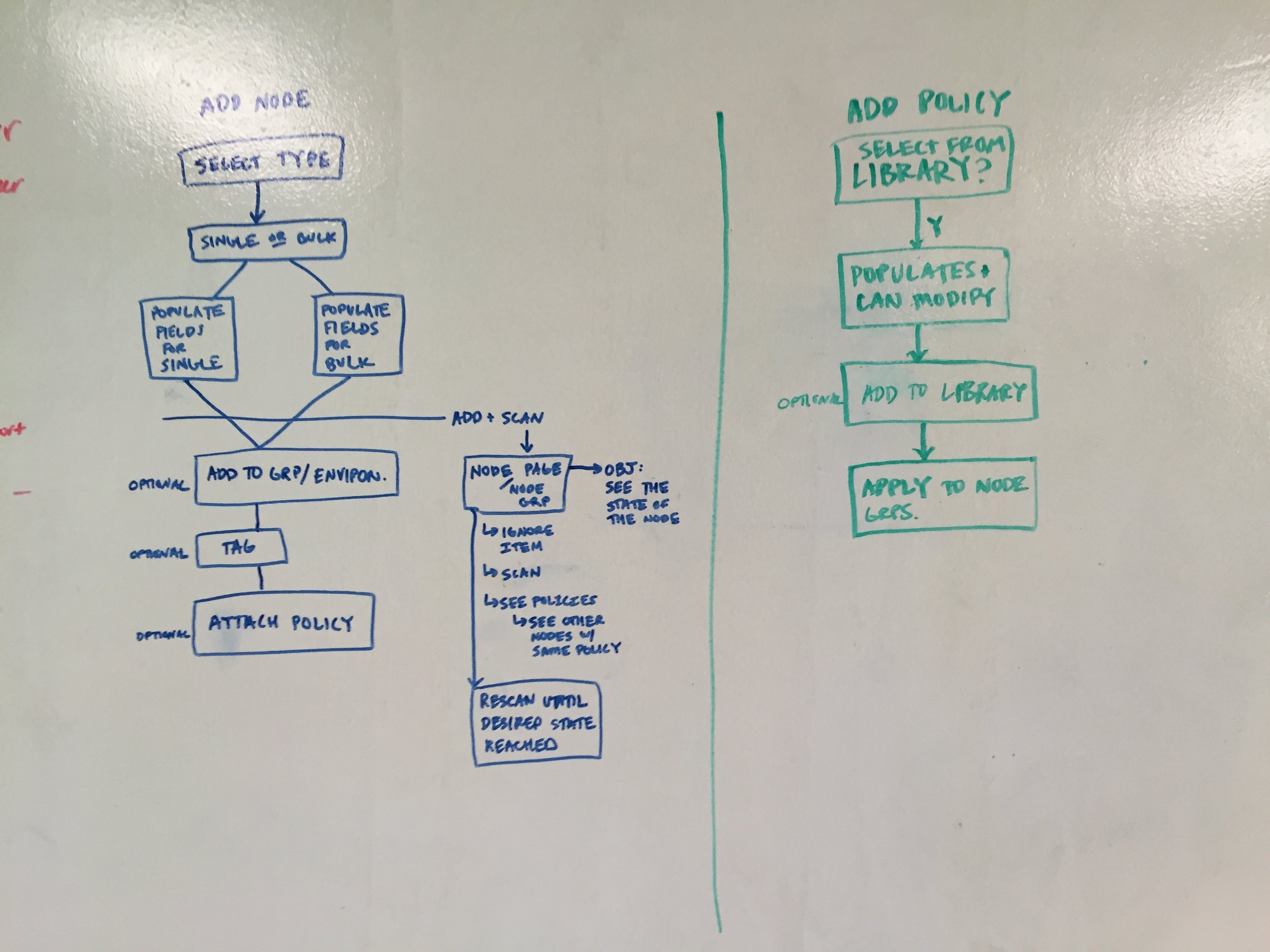
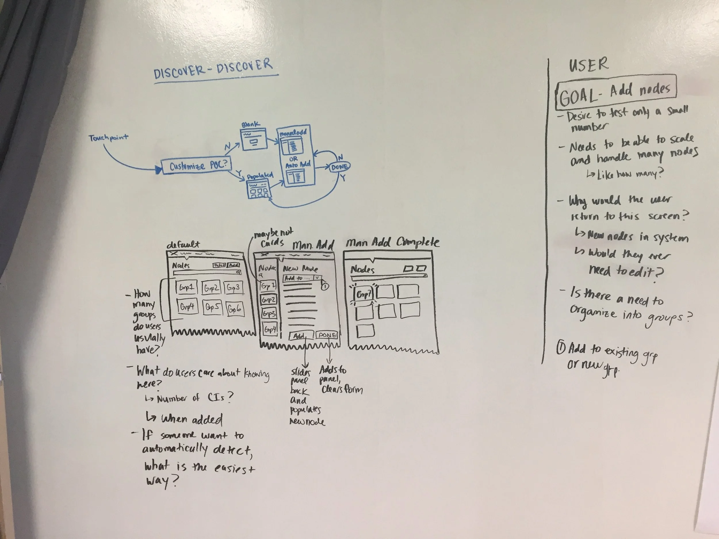
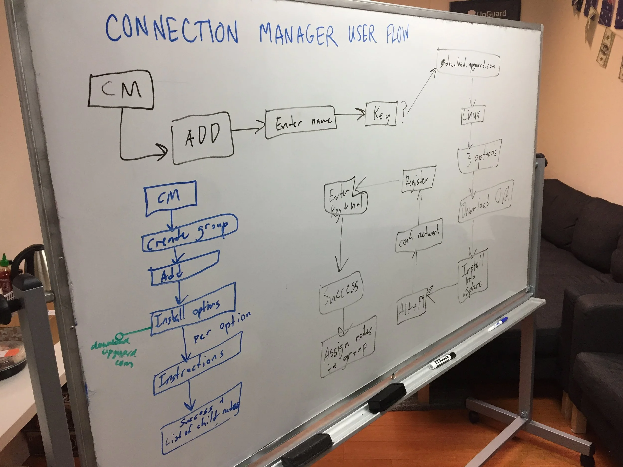
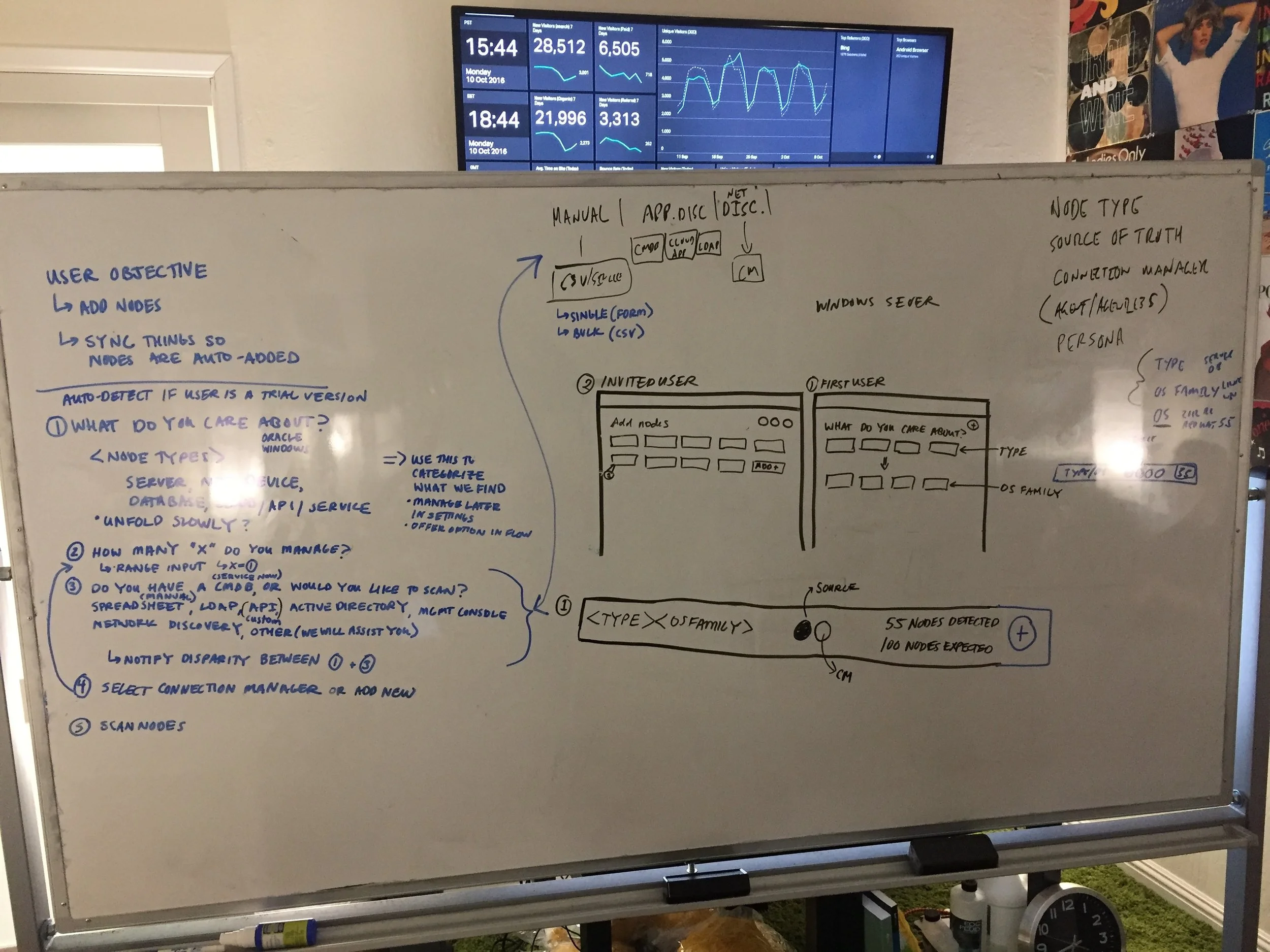
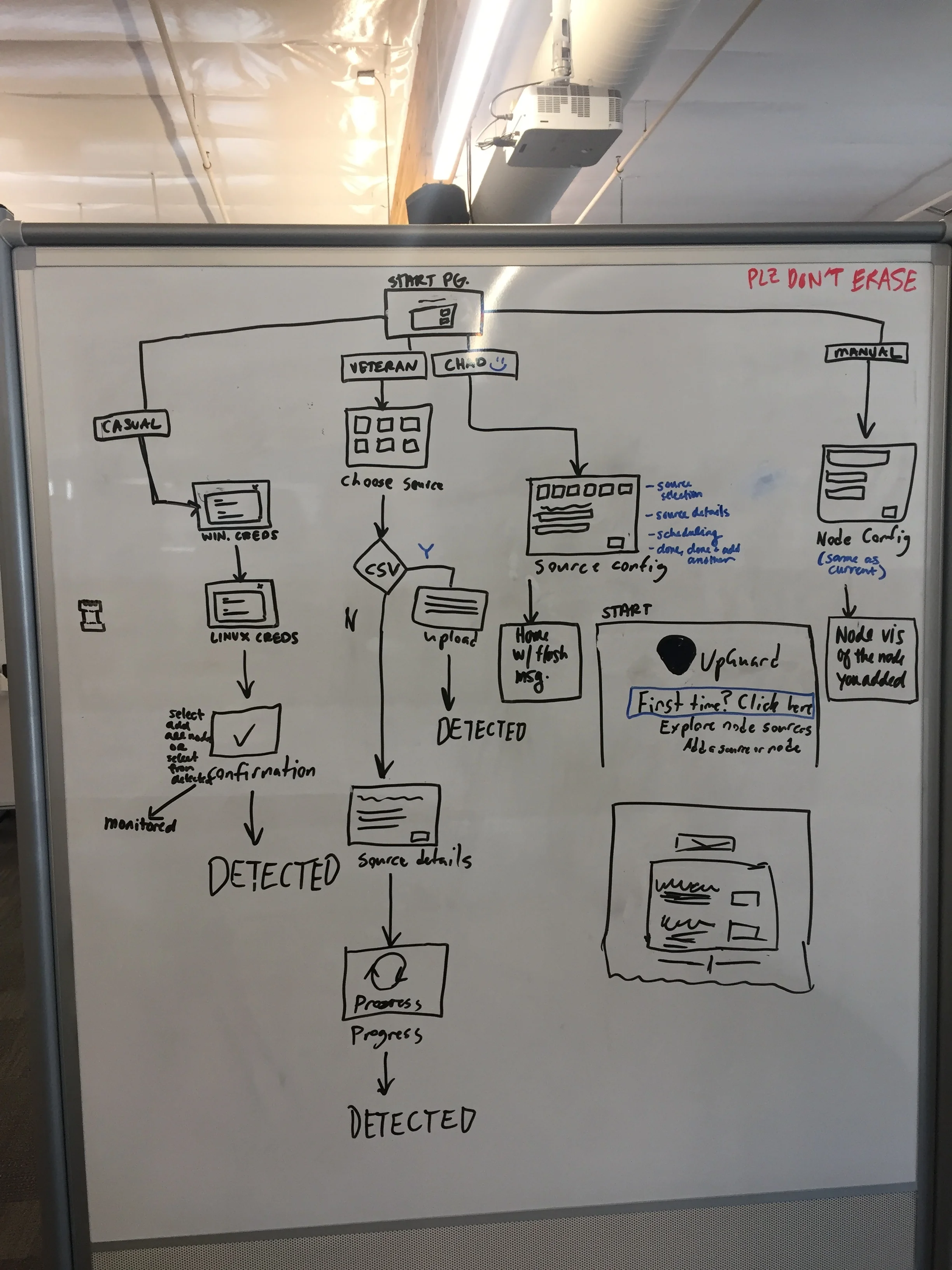
Working closely with PMs, the customer success team, and engineers, we mapped out common workflows.
Understand the user
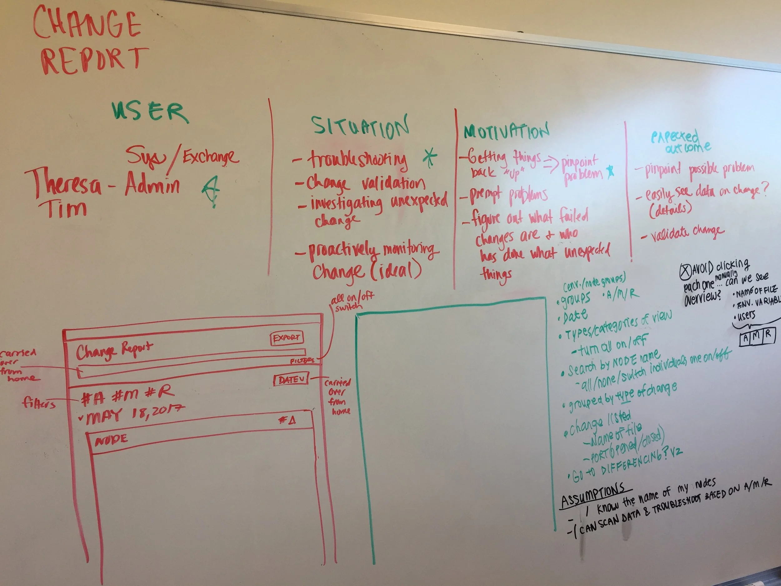
I read the book "The Phoenix Project" and conducted interviews with the customer success team, leadership, and sales to understand the problems UpGuard tries to solve.
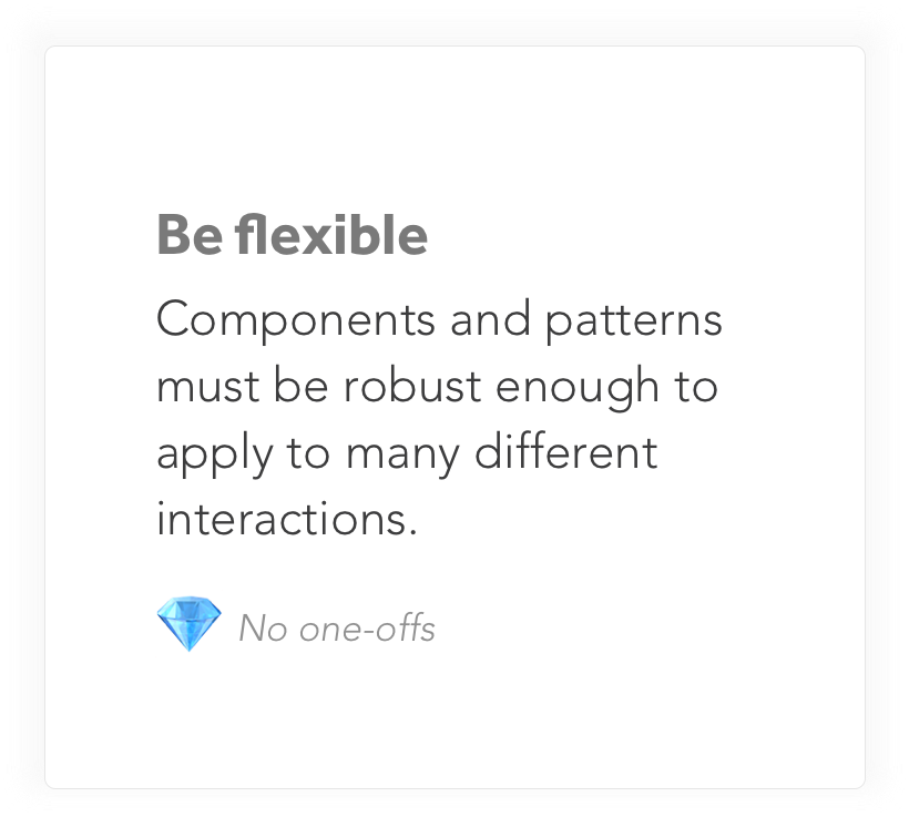
Build a philosophy
We followed three main tenants when creating and adding to the system.


Create a high level guideline
We created compartments for acting vs. viewing data.
Identify potential layouts
Below the header was a work area that housed the relevant data is displayed.
Create patterns & components
We had all the easy stuff in there like buttons, searchable dropdowns, chip-created query bars, radio buttons, text inputs, and error states to name a few.
These items were created in a React library with example code developers could use as a starting point.
Spec out the details
A header was placed at the top of the page. This housed all the actions and high level information.
Add new stuff
We added many patterns. A timeline, a workflow, and commenting to name a few.
Conclusion
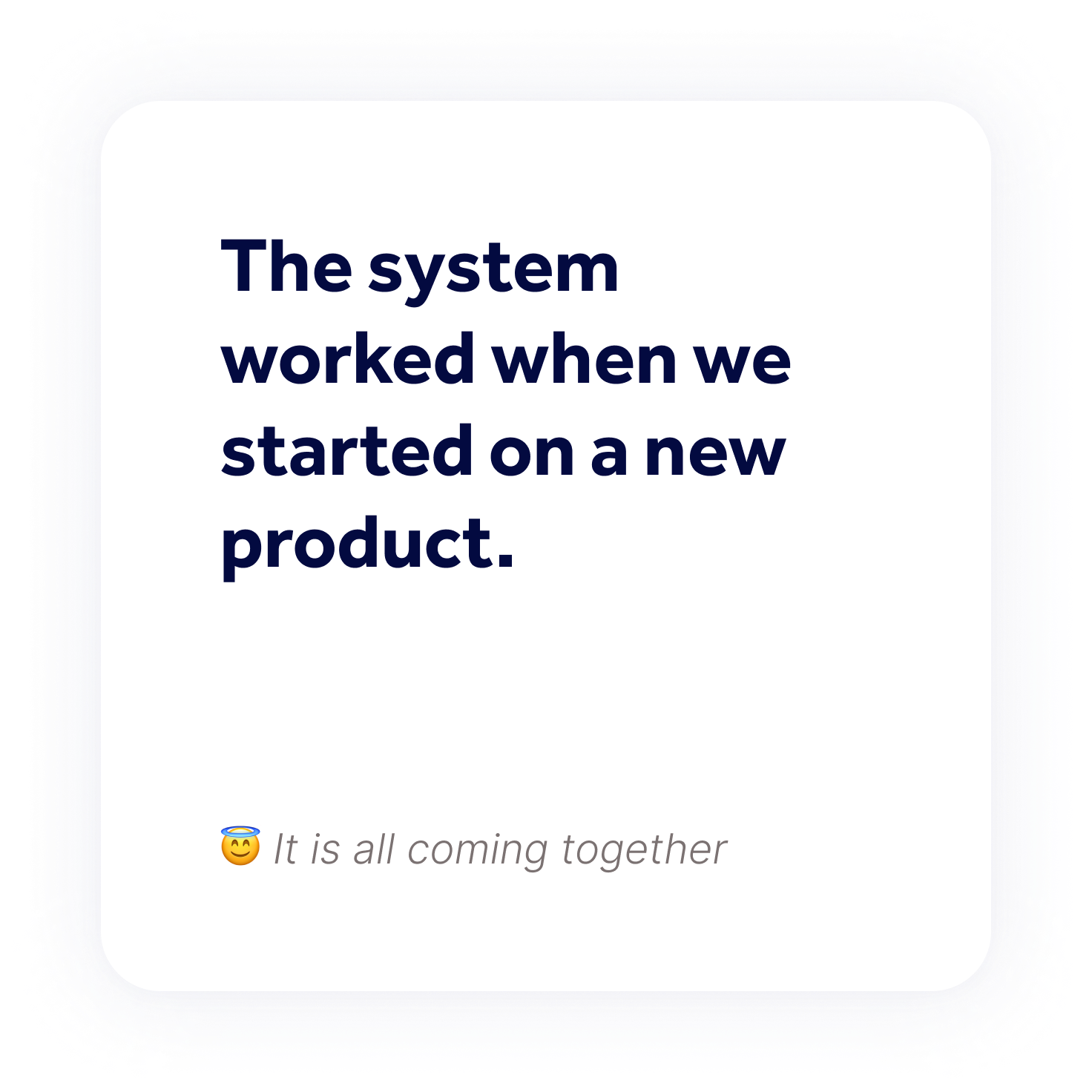
This was my first design system.
The main thing I would have done differently is the navigation. I totally left it out and it ended up being the only thing that was confusing to users.
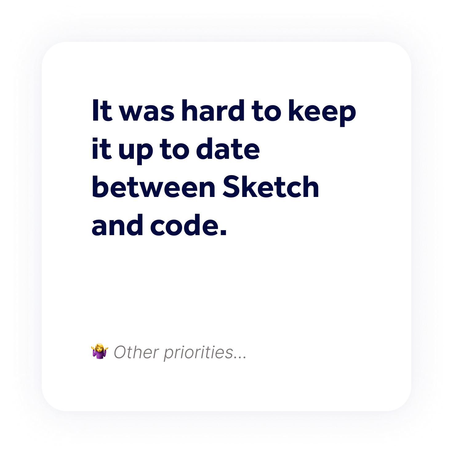
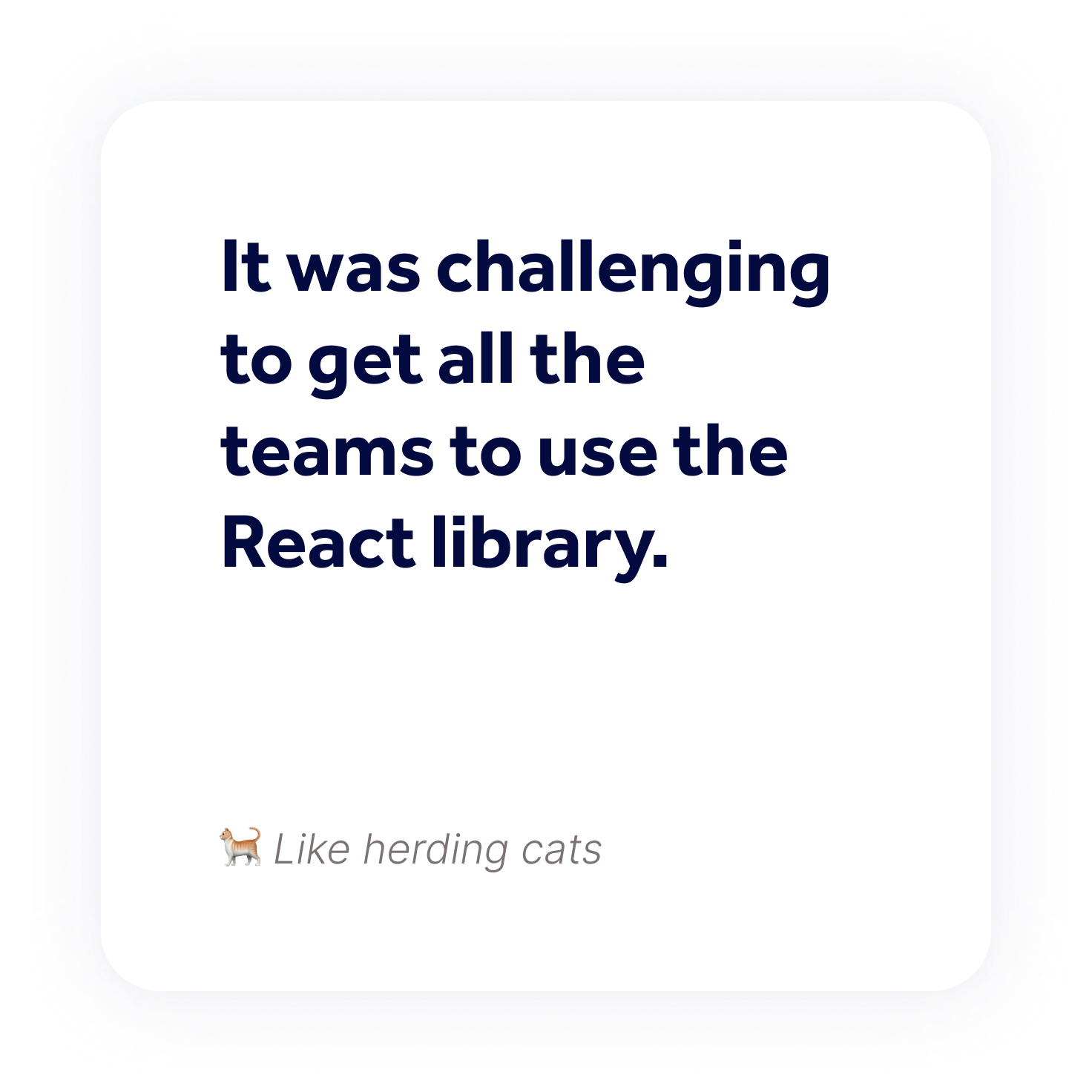
The React library built from the system specs had a low adoption rate on some engineering teams. If I were to do this again, I would have spent more time building alignment between teams.
Other case studies
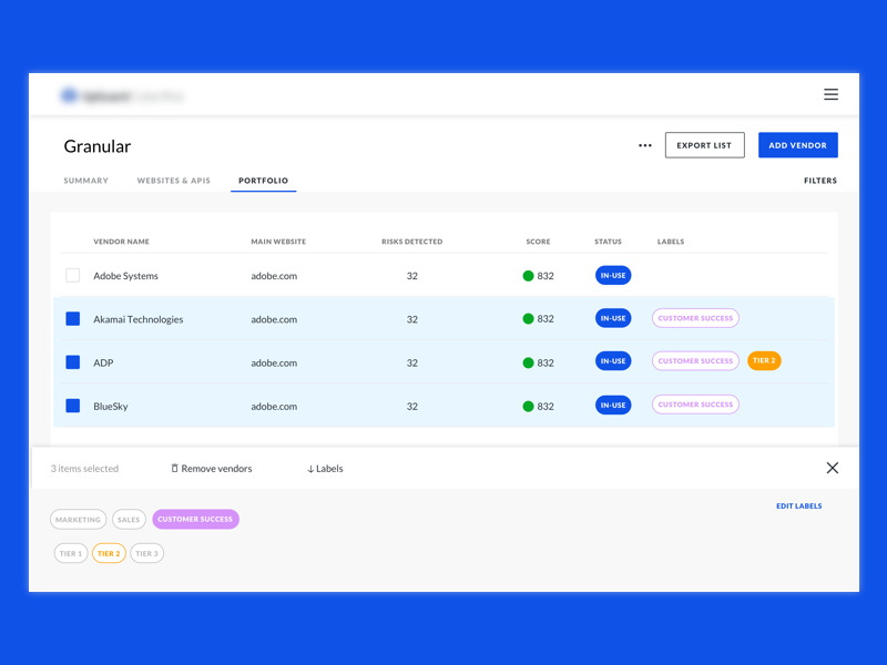
UpGuard CyberRisk
Lead Product Designer • 2016-2018
A web app that monitors external-facing IT assets for security flaws.
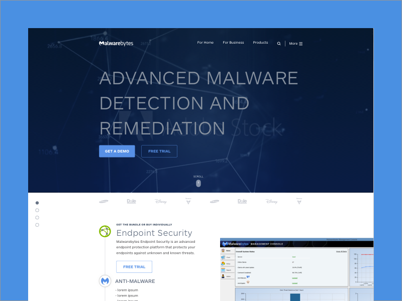
Malwarebytes
UI/UX Designer • 2015-2016
Malwarebytes website redesign.