Malwarebytes Rebuild
Malwarebytes makes a suite of software to help businesses and individuals live malware-free.
Problem
How could the Malwarebytes marketing website explain the product offerings clearly, look legit, and rapidly test new ideas?
My role
I was the design lead, overseen by the Creative Director, Rob Bajohr. You’ll see most of the assets I was responsible for creating.
Key business results


Personal achievements


What didn’t go well


Before and After
Objectives
Clearly describe product offerings
Modernize and simplify the user experience
Create consistency across entire site
Improve SEO
Establish a starting point
When I first started at Malwarebytes, I started working on the website rebuild. As a first step, I created a map of all the pages I could find.
This artifact helped us understand which areas of the site were controlled by which technologies and departments.
Stakeholder discovery
I gathered requirements from each stakeholder.
I also surveyed sales to make sure their pitch matched the website. Additionally, I surveyed customer success team to see if the website could help.
I found that users accidentally downloaded the PC/Windows version on a Mac because it wasn’t clear on the website.


Proto-personas
Since I was the only designer fully dedicated to the website, many ideal steps had to be cut short due to a tight timeline.
One of these steps was persona creation. I used the research done previously to develop proto-personas.


Flows
With personas in hand, I mapped out critical user journeys for each one.
Design philosophy
In order to prevent backtracking into patterns that created the site we were trying to improve, we agreed on some core design principles:


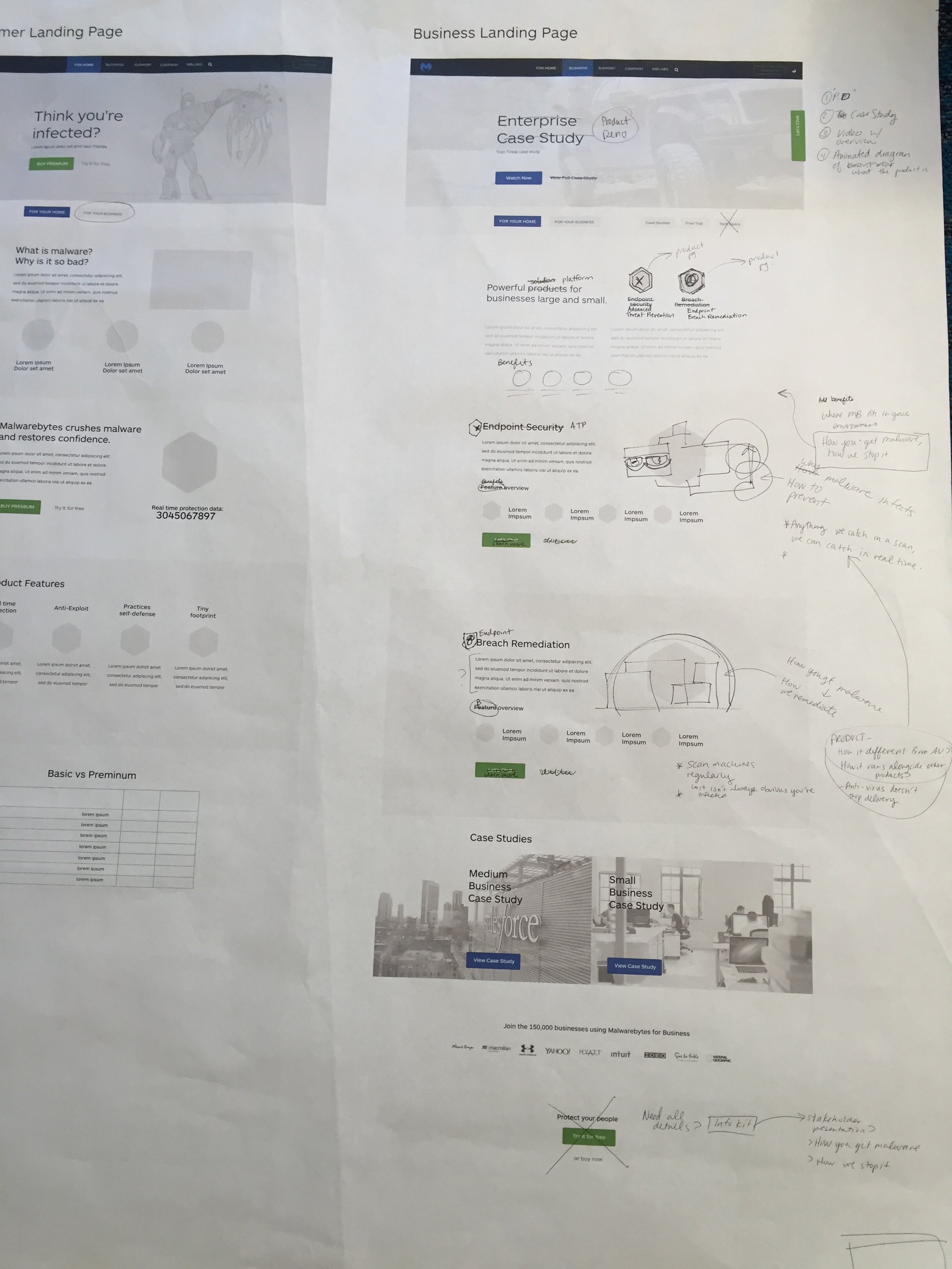
Wireframe
Using the architecture and requirements gathered during discovery, I created wireframes of all pages with "MVP" modules and components.

Click test
Using Notable, I drafted a quick click test to see if our MVP modules made sense.
One of the obstacles we faced during this process was an extremely accelerated timeline. Usability testing and validation are essential to an ideal process but with an accelerated timeline and limited resources, I did as much as I could.
Moodboard
Look n’ feel exploration
Exploring different looks helped me gauge what fits the culture, brand, and user base.


As I explored with the team, I tried to come up with what I wanted users to feel when they visit the site. I also wanted to match the style of the product so there wasn't a gap between what users saw before they entered the product and what user saw after. We researched competitors and brainstormed what we wanted to do and what we didn't want to do.
Where we landed:
We aren't dark and scary
We aren't generic
We are friendly and playful
We are trustworthy
We are a utility
We are honest
Reviews and iterations
Each week, we reviewed the mocks with stakeholders to make sure we were satisfying the requirements and gathering feedback.

Prototype
Using Invision, I created a very basic prototype and refined it based on stakeholder feedback.
Components
Each module is made up of components. I created and spec'd how each component would be on mobile and desktop.
Content
In order to save time, we built the components before the final design and content was complete. That way, our development team already had a large portion of the coding done by the time we submitted something "final"
We used Invision's Liveshare and comment features to merge content and design.


Iconography
Launch
We launched the new site. On time.
Here is what happened, the good and the bad.
1. Consumer PC downloads went up.

2. Consumer Mac downloads stayed about the same.

3. Lead volume dipped (no indication of how yield or quality of leads did). So we launched a new flow that had more emphasis on business.


This is a screenshot the development team sent me about the performance post-launch
The ability to quickly adapt when we saw numbers decline was intentional and one of the goals of the rebuild.
4. Purchases (consumer and small business combined) stayed the same

What's next?
This is the roadmap I created for the next phase of the website. I did a lot of the PM work for the website.

Conclusion
This website redesign was a success because:
Usually numbers plummet after a redesign, but for this one the only number that dipped was lead volume and we were able to bring that back up without impacting the other numbers
Established a clear hierarchy with type and imagery
Established consistency through visual language
Removed some complexity out of cyber security by creating a design philosophy conducive to simplicity
Built a system that can be optimized in a sustainable way
Aside from the performance, the most rewarding thing about the redesign was seeing how much the foundation, modularity, and architecture lead to easy, rapid changes and tweaks. One of the directors in the marketing department even remarked that changes we made post-launch in a few hours would have taken much longer to create in the previous site.
The main thing I learned during this journey is how to include a large group of outside stakeholders in the design process. I also learned how to balance project management and design work.
What I would do differently
Despite weekly reviews of the mocks, stakeholders were not given ample opportunity to voice their concerns. I would have made more time to explore the ideas that seemed out-of-reach or different than what I was thinking.
Other case studies

UpGuard CyberRisk
Lead Product Designer • 2016-2018
A web application that helps businesses prevent data breaches through improved visibility of external-facing assets.

UpGuard Design System
The journey of creating a design system of consistent and flexible components.